13 About Me Black and White Bullet Journal
Black and white designs are timeless, elegant, and versatile. They work beautifully in any Bullet Journal and are perfect for those who prefer a minimalist aesthetic. Below are 13 About Me black and white ideas that will help you document your story with sophistication and simplicity.
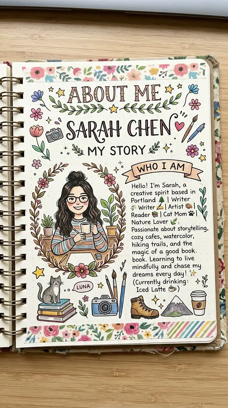
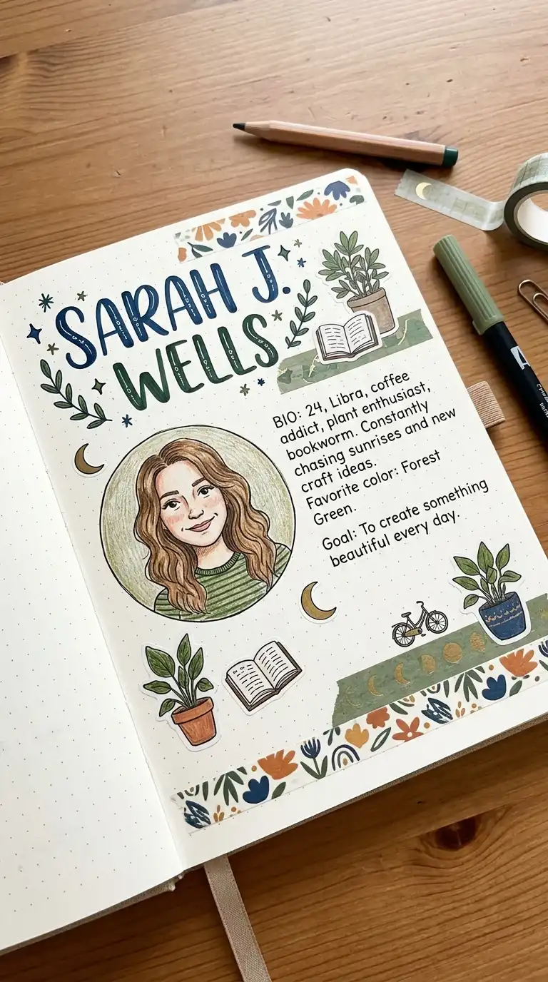
1. The Minimalist Personal Profile
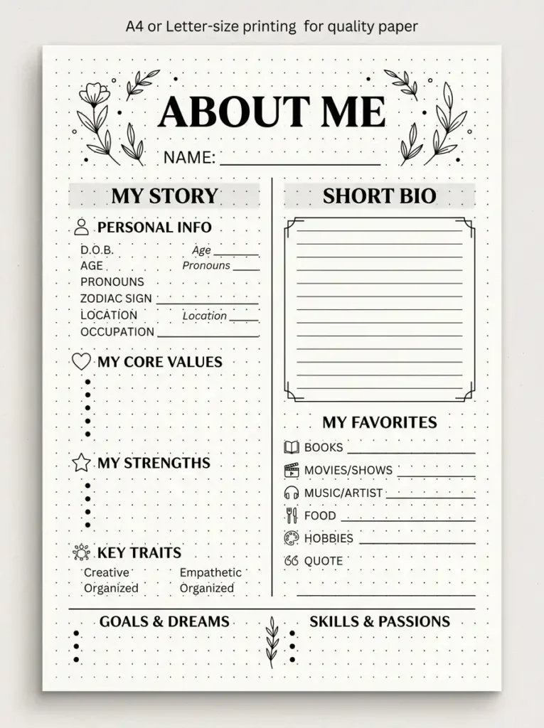
This page is your introduction—clean, simple, and elegant. The absence of color makes the design focus on typography and layout.
Create a page with your name in large, bold lettering at the top. Below, list personal details in a clean column: birthdate, birthplace, current location, occupation. Add a short bio paragraph in a smaller font. Frame the page with a simple border or leave it completely bare for maximum minimalism.
QUICK TIPS
- Use different font weights to create hierarchy.
- Let white space be your design element.
- Keep handwriting consistent and clean.
2. The Typography Favorites Page
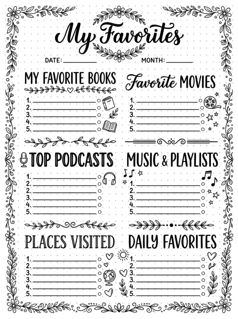
Make your favorites list a typography-focused design. This page uses varying font styles and sizes to create visual interest without color.
Write each category in a different font style or size. Use bold for the category names and regular for the list items. Add decorative flourishes like underlines, boxes, or simple dividers. This page becomes a study in black and white design.
QUICK TIPS
- Practice different font styles before committing.
- Use a ruler for straight lines and dividers.
- Add small geometric shapes as decorative elements.
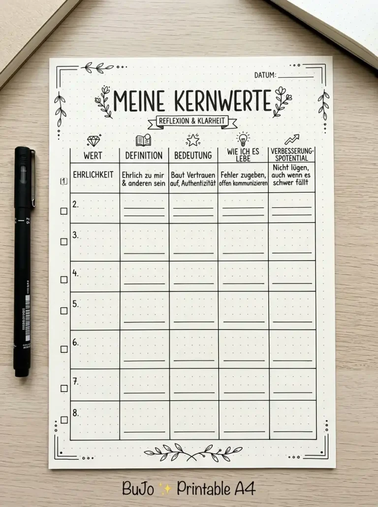
3. The Geometric Core Values Page
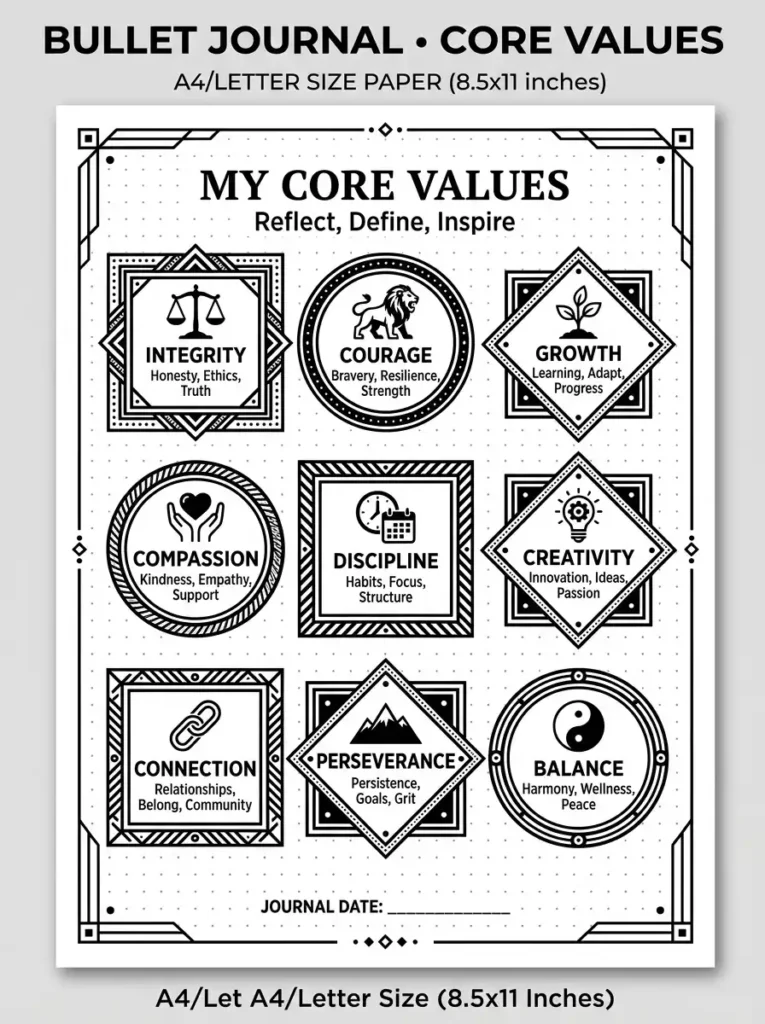
Use geometric shapes to frame your core values. This adds structure and visual interest to a serious topic.
Draw a simple shape—a circle, square, or diamond—around each core value. Arrange the shapes in a pattern across the page. Inside each shape, write the value name and a brief definition. The geometry creates a cohesive, modern look.
QUICK TIPS
- Keep all shapes the same size for consistency.
- Use a protractor or ruler for precise shapes.
- Leave space between shapes for readability.
4. The Line Art Personality Page
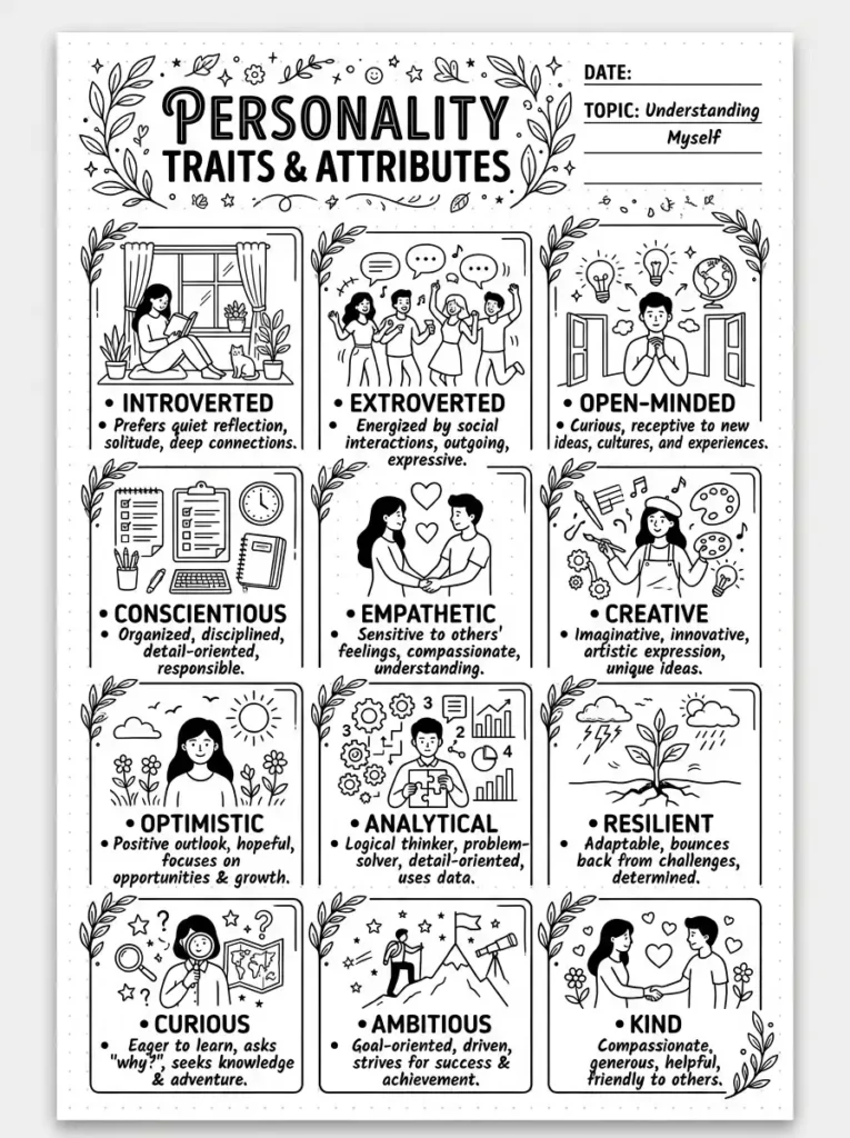
Incorporate line art illustrations into your personality page. Simple black and white drawings add visual interest without overwhelming the content.
Draw small line art illustrations that represent different aspects of your personality—a book for being a reader, a globe for loving travel, a brain for being analytical. Label each illustration with a brief description of that personality trait. This page is both artistic and informative.
QUICK TIPS
- Keep illustrations simple and consistent in style.
- Use a fine-tipped pen for clean lines.
- Practice drawings on scrap paper first.
5. The Doodle Life Timeline
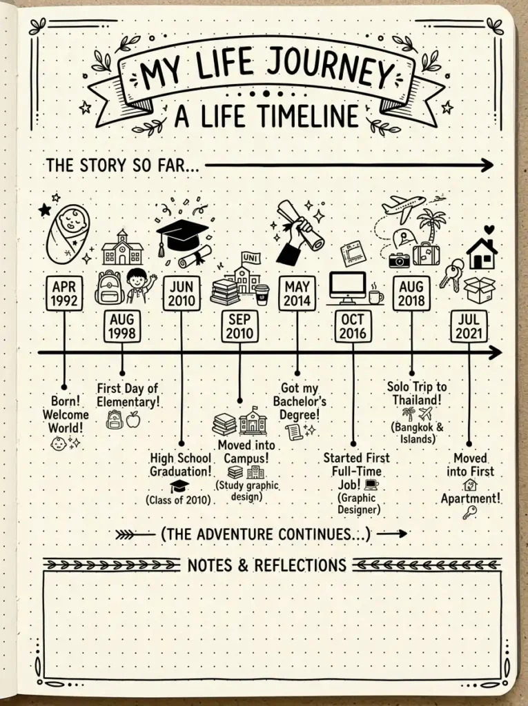
Use black and white doodles to illustrate your life timeline. This adds a playful, personal touch to your historical record.
Draw a horizontal timeline across the page. At each significant event, add a small doodle—a house for a move, a graduation cap for school, a plane for a trip. Write the date and event name below the doodle. The doodles make your history come alive.
QUICK TIPS
- Keep doodles small and simple.
- Use consistent spacing between events.
- Don’t worry about perfection—doodles should feel hand-done.
6. The Bullet Point Bucket List
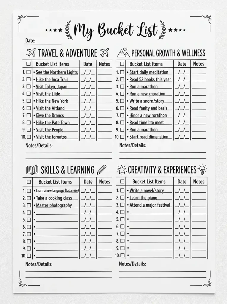
This clean, functional bucket list uses bullet points and simple design elements. It’s easy to read and update.
Organize your bucket list into categories with clear headers. Use bullet points for each item, with a small checkbox or square next to each. Add a line for completion date and notes. The black and white design keeps the focus on your dreams.
QUICK TIPS
- Use consistent bullet point formatting throughout.
- Leave space between categories for visual breathing.
- Add a small icon next to each category for visual interest.
7. The Grid Strengths & Skills
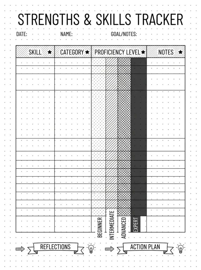
Use a grid format to inventory your strengths and skills. This layout is clean and easy to scan.
Create a table with clear columns: Skill, Category (hard or soft), Proficiency Level, and Notes. Use different shading patterns (crosshatching, dots, or lines) to differentiate between levels or categories. The grid structure makes this page look intentional and organized.
QUICK TIPS
- Use a ruler for straight grid lines.
- Experiment with different shading patterns.
- Keep notes brief for easy scanning.
8. The Connect-the-Dots Relationship Map
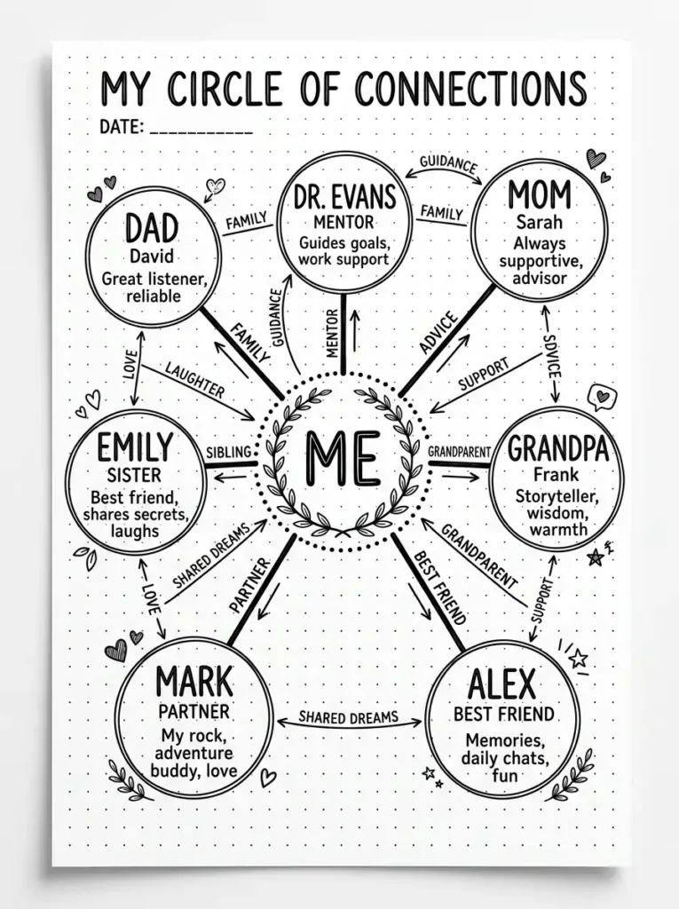
Create a visual relationship map using dots and connecting lines. This interactive layout makes your connections visible.
Place a central dot for yourself in the middle of the page. Around it, place dots for important people in your life—family, friends, mentors, colleagues. Draw lines connecting each person to you. Add labels for each person and a brief description of the relationship. The visual network tells a story.
QUICK TIPS
- Place dots at varying distances to show closeness.
- Use different line weights for different types of relationships.
- Add small symbols next to each person for additional context.
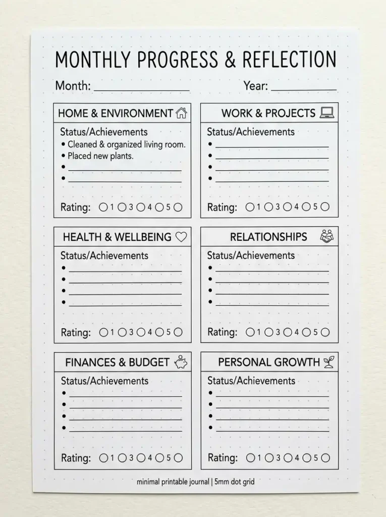
9. The Minimalist Life Canvas
Use clean lines and simple sections to map your current life across multiple dimensions. This page is a snapshot of your present.
Draw a simple grid with sections for each life area—Home, Work, Health, Relationships, Finances, Growth. In each section, write a brief status update and a rating (1-10). Use minimal text and generous white space. The design is clean and reflective.
QUICK TIPS
- Keep all sections the same size for symmetry.
- Use a single font or handwriting style throughout.
- Leave white space around each section.
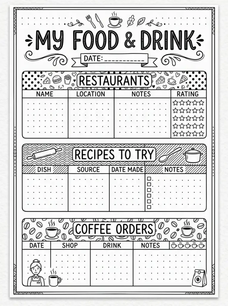
10. The Patterned Food & Drink Page
Use patterns—stripes, dots, chevrons, crosshatching—to organize your food and drink favorites. The patterns add visual interest without color.
Create sections for different categories (restaurants, recipes, coffee orders). Use a different pattern for each section header or as a background. This design is playful and visually engaging while staying monochrome.
QUICK TIPS
- Practice patterns on scrap paper first.
- Use patterns sparingly to avoid visual clutter.
- Keep text clear and readable against patterns.
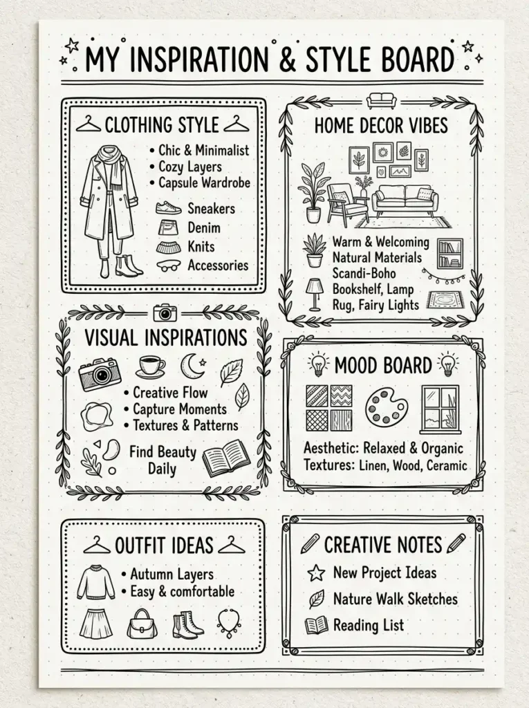
11. The Framed Style & Aesthetic
Frame your style and aesthetic preferences with elegant black and white borders. This adds structure and visual interest.
Create a page with multiple smaller frames or sections, each dedicated to a different aspect of your style—clothing, home decor, visual inspiration. Inside each frame, write brief descriptions and add small sketches or symbols. The frames create a curated, gallery-like feel.
QUICK TIPS
- Use consistent frame sizes for a cohesive look.
- Add a small label above each frame.
- Keep sketches simple and clean.
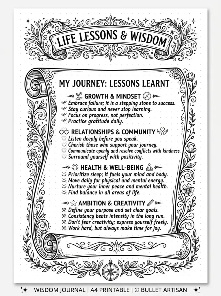
12. The Scroll Lessons Learned
Design your lessons learned page as an ancient scroll. This creative layout adds a sense of wisdom and timelessness.
Draw a scroll shape on your page with rolled ends. Inside the scroll, list your life lessons in chronological order or by category. Add small decorative flourishes at the top and bottom. The scroll design makes your wisdom feel important and worth preserving.
QUICK TIPS
- Sketch the scroll shape lightly in pencil first.
- Write lessons inside the scroll in neat handwriting.
- Add a small banner with “Wisdom” or “Lessons” at the top.
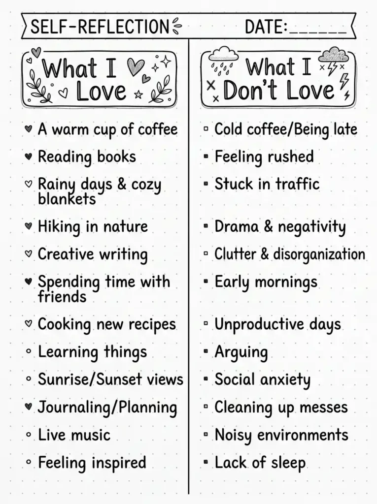
13. The Split-Page Comparison Layout
Use a split-page design to compare and contrast different aspects of your personality or life. This layout creates visual balance and clarity.
Divide your page vertically into two equal halves. On the left side, list one category (like “What I Love”). On the right side, list its opposite (like “What I Don’t Love”). Use parallel structure for each pair of entries. This layout creates a powerful visual of duality.
QUICK TIPS
- Use a ruler for a clean vertical line.
- Keep entries parallel in structure and length.
- Add a title at the top spanning both sides.
Final Thoughts
Black and white About Me pages are timeless, elegant, and accessible. They require no colored pens or supplies, yet they can be incredibly beautiful and expressive. The key to great black and white design is thoughtful use of contrast, texture, and negative space.
Start with a layout that appeals to you and experiment with different line weights, patterns, and typography. As you develop your black and white style, you’ll discover that monochrome design can be just as rich and personal as full color.